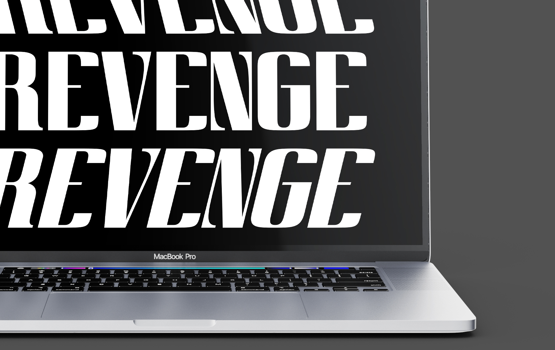
Innerhalb von zwei Wochen lernte ich das Programm «Glyphs» kennen und kreierte damit meine eigene Schrift. Als Basis diente ein Raster, das ich aus einer dekonstruierten Velolampe entwickelt hatte. Daraus entstand die statische, blockartige Grotesk-Schriftfamilie «Revenge». Diese besteht aus drei Schriftschnitten – Roman, Ritalic und Italic – und eignet sich gut für Headlines und/oder Plakate. Der Name bezieht sich auf den Entstehungsprozess: Während mein erster Entwurf wenig dynamisch wirkte, entstand durch das Ausbrechen aus dem starren Raster eine visuell spannendere Schrift.
Within two weeks, I became familiar with the “Glyphs” program and used it to create my own font. A grid I had developed from a deconstructed bicycle lamp served as the foundation. The result was the static, block-like grotesque font family “Revenge,” which consists of three weights: Roman, Ritalic, and Italic. It is well-suited for headlines and/or posters. The name reflects the design process: while my initial design felt static, breaking free from the rigid grid led to a more visually dynamic font.